Website chat popups that convert: pre-chat popups visitors actually click
How to design pre-chat popups and proactive chat greetings that start conversations: the right moments, help when a discount code fails, real faces and reply times, and one per visit.

On this page
- What a pre-chat popup is
- Why most chat popups get closed
- Show a popup when the visitor gives you a reason
- Rescue the sale at the moment of friction
- Show who will reply, and how fast
- Write a proactive chat greeting people answer
- Match the design to the job
- Timing and frequency: one good popup beats five
- Popups on phones
- Keep your page fast
- Measure chats per view, popup by popup
- A starter setup for a small team
- Where popups fit with the rest of proactive chat
Key takeaways
- A chat popup converts when it's about the visitor's moment: a return visit, a pricing page, an arrival from a campaign, an order on its way. The generic "Hi! Any questions?" card is the one visitors learn to close.
- The popup that saves the most sales is help at the moment of friction: a card right beside a discount code that failed or a checkout step that errored, one tap from a person who can fix it.
- Show who will actually reply, and how fast. Real faces and a measured reply time earn the click. An AI assistant should always be labelled as AI.
- One popup per visit is plenty for most websites. A frequency cap protects trust better than any clever line.
- Match the design to the job: a quiet badge for availability, a card for a welcome, a ticket for a code, a tracker for an order, time tiles for a call.
- Judge each popup by chats started per view, page by page, and change the message or design before you switch it off.
Every website with live chat has met the generic chat popup. A card slides up beside the chat button three seconds after the page loads: “Hi there! 👋 Any questions?” Visitors close it on the first page, close it again on the second, and by the third they’ve stopped seeing it at all.
That’s a shame, because the idea behind it is sound. Plenty of visitors have a question they’d never bother to type, and a well-timed invitation is often the difference between a sale and a closed tab. The problem isn’t the popup. It’s a popup with nothing to say, shown to everyone, at a moment that means nothing.
This playbook covers how to design pre-chat popups and proactive chat greetings that people actually click: the moments worth interrupting for, what to show and say, which design fits which job, and how to tell whether a popup earns its place. The examples come from Kettlewell Outdoor, a walking boots and outdoor clothing store in Leeds with a small support team.
What a pre-chat popup is
Pre-chat popups sit between two other kinds of proactive chat. Auto-open is heavier: the whole chat window opens on its own. A proactive message from a teammate is lighter on rules and heavier on effort: someone watching live visitors writes to one person. A popup is the scalable middle. You decide once when it shows and what it says, and it does the job on every visit.
Why most chat popups get closed
Before designing good popups, it helps to name what makes the usual ones fail. Almost every ignored popup breaks one of these five rules.
- It says nothing specific. “Questions? Chat with us!” is about you, not the visitor. It would read the same on the home page, a size guide and an error page.
- It shows at a meaningless moment. Three seconds after load, the visitor hasn’t read anything yet, so there’s nothing to have a question about.
- It makes a promise nobody keeps. “We’re online!” with a green dot, when the reply will actually come tomorrow. One broken promise teaches the visitor to ignore the next one.
- It shows too often. On every page, on every visit, sometimes stacked with a newsletter popup and a cookie banner.
- It gets in the way. It covers the product photo or the add-to-basket button, or pushes content around as it loads.
Fix those five and you’re most of the way to a popup that converts. The rest of this guide is how.
Show a popup when the visitor gives you a reason
The single biggest improvement you can make is to stop greeting everyone and start greeting the visitors who’ve given you a reason. Some moments are almost always worth a popup, because the visitor either has a question or is about to give up.
A table of ten moments. Anyone, while someone can reply, sees who is in and the reply time. When a discount code fails, a card beside it asks Code not working? Hannah can sort it out. A signed-in shopper whose order moves a step sees Your order #1042 on a tracker. A visitor who'd rather talk sees Book a call with Hannah and the next free times. A first visit gets New here? Ask us anything. A pricing page gets Questions about the Sock Club? A considered purchase gets Talk with a boot fitter. A visitor from a campaign gets their code, ready to copy. A basket worth over £100 gets a code too. And after hours, the popup says when the team is back and offers to take a message.
The three that almost always pay off
- Who’s answering. Not a message at all, really: a quiet sign of who’s in and how fast they reply, shown only while someone can reply. It sets expectations before the visitor ever asks.
- A discount code that fails. The visitor has chosen, and the checkout has just told them no. It’s the moment a sale is most likely to be lost, and the easiest one to save. More on this below.
- An order on its way. For signed-in shoppers, where their order is (ordered, packed, shipped) answers the most common question in ecommerce support before anyone has to ask it. If something does look wrong, the chat is one tap away, with the order number already in it.
The ones worth a little setup
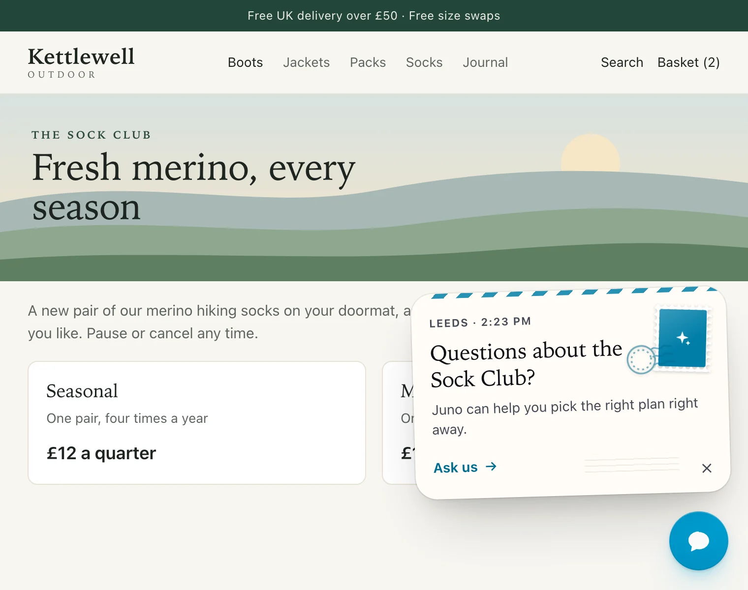
- Pricing or plan pages. Visitors here are deciding. A question such as “Questions about the Sock Club?” helps them decide with you rather than without you.
- Talk to an expert. For considered purchases (boots, bikes, software for a whole team), an invitation to talk to a specialist works better than a generic hello.
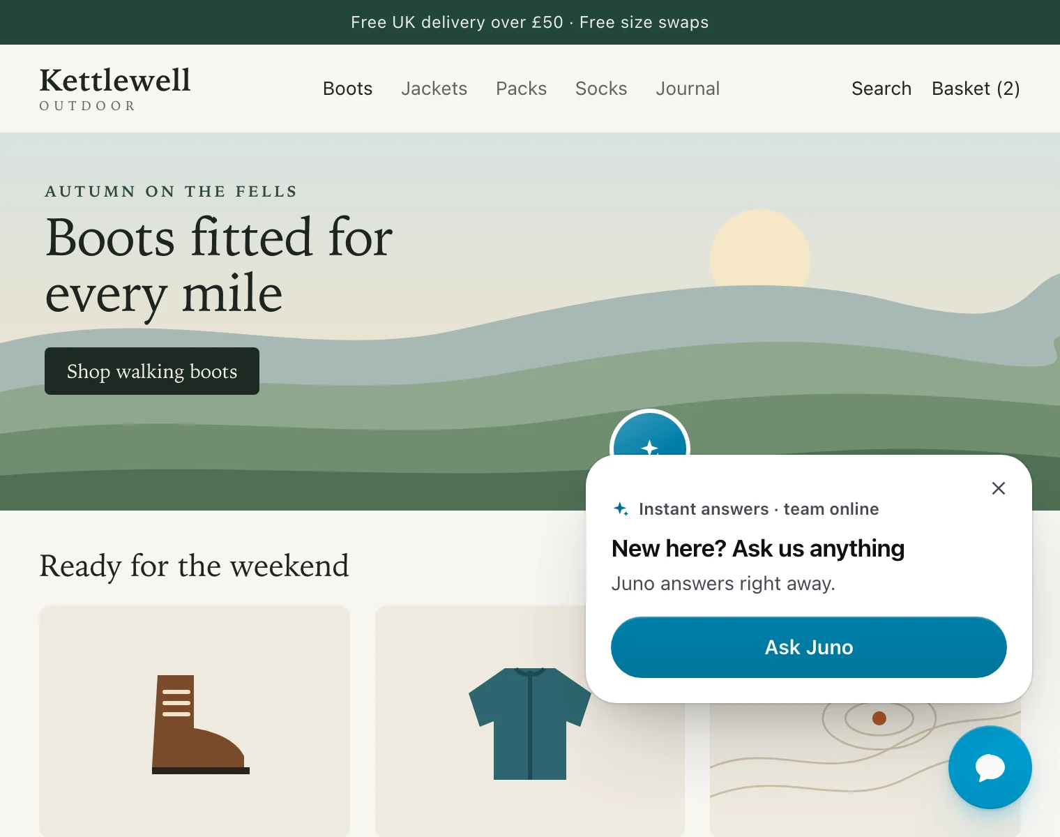
- First visit. A short, warm hello from a real team, with no ask attached. Best on sites where trust is the first hurdle.
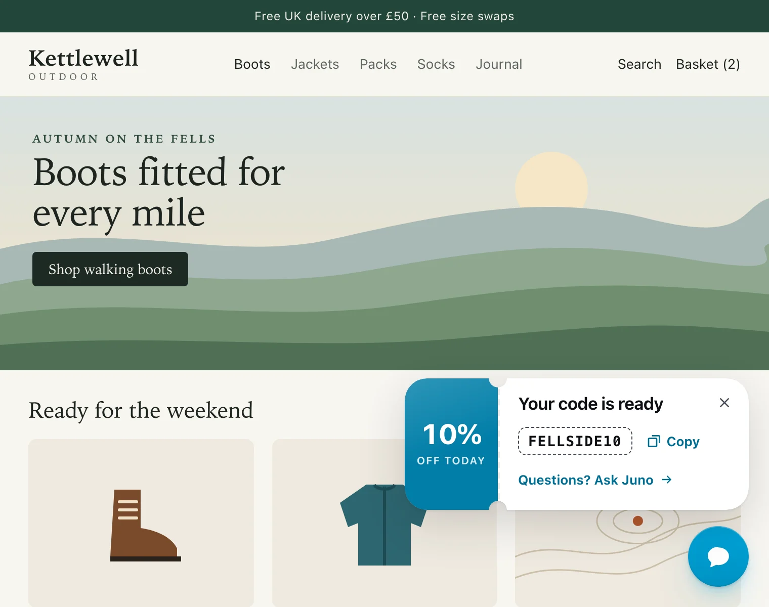
- Campaign arrivals. Visitors from an email or ad campaign often arrive with an offer in mind. Show it to them, ready to copy, instead of making them dig through the email again.
- A full basket. A code that appears once the basket passes an amount you choose gives a hesitating buyer a reason to finish today.
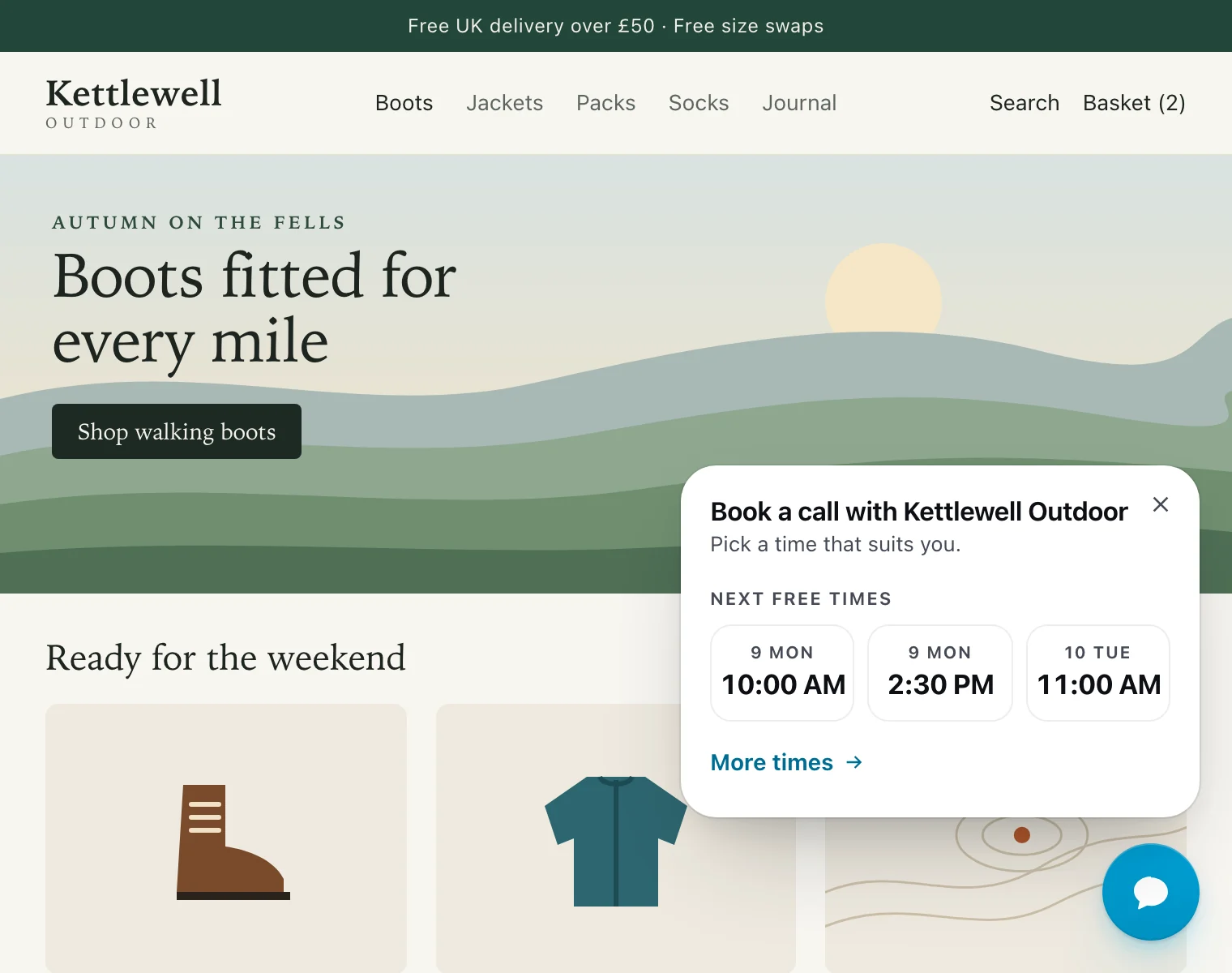
- A call booked straight from the page. For services, B2B and big-ticket products, the next three free times from your calendar turn “I’d like to talk this through” into a booked call in two taps.
- After hours. When nobody can reply, say so, say when you’re back, and offer to take a message. It’s the honest alternative to a green dot that lies.
Rescue the sale at the moment of friction
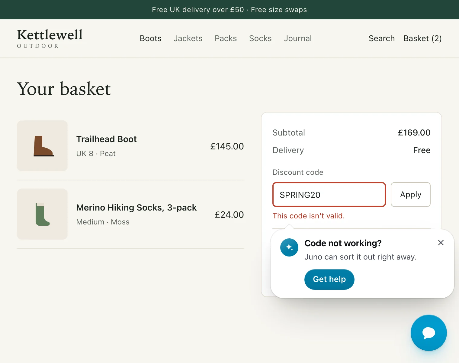
Most popups invite a conversation. The most valuable one answers a problem. When a shopper types a discount code and the page says “This code isn’t valid”, they’ve already decided to buy. What happens in the next ten seconds decides whether they finish or leave to hunt for another code.
A rescue popup appears right beside the error, pointing at it, with a person who can sort it out and how fast:
What makes a rescue popup work:
- It’s right where the problem is. Beside the field, not in the corner. The visitor doesn’t have to connect the help to the problem.
- It does the explaining. One tap opens the chat with “My discount code isn’t working.” already written. The visitor doesn’t have to describe what went wrong.
- It shows once. Once per kind of problem per visit is enough, and a close keeps it away for a good while.
- It takes priority. A visitor who’s stuck matters more than any welcome or campaign. A rescue can show even when another popup already has.
The same goes for a checkout step that fails: “Stuck at checkout?” beside the error, one tap to someone who can help, beats a support link at the bottom of the page every time.
Show who will reply, and how fast
Visitors click popups that tell them what will happen next. The two facts that matter are who will answer and how fast.
A face and a name (“Hannah”) make the invitation feel like a person’s, which it is. A reply time (“about 2 min”) answers the question every visitor silently asks: is it worth typing this, or will I be waiting all afternoon? Together, they turn “chat with us” from a vague promise into a specific one.
Three rules keep this honest:
- Use the measured reply time, not a hopeful one. If your team usually replies in four minutes, say four. Visitors forgive a wait they were told about; they don’t forgive a broken promise.
- Show only people who are actually there. A row of smiling faces at 2am, when nobody will reply until 9, does more harm than no popup at all.
- Label AI as AI. If an AI assistant will answer, the popup should say so, plainly. Visitors are happy to get an instant answer from an assistant. They’re not happy to discover that the friendly name they were chatting with was a bot.
Write a proactive chat greeting people answer
Once the moment is right, the message has one job: make it easy to reply. The best proactive chat greetings share four habits.
- They name what the visitor is doing. The page, the product, the error. “Still deciding on the Trailhead Boot?” proves the message was meant for them.
- They ask one thing. Not “Any questions about sizing, delivery, returns or our sock club?” Pick the most likely question for that page.
- They offer a real next step. “Ask Hannah” or “Check my code” says exactly what happens on click. “Start chat” says nothing.
- They stay true. No fake urgency, no countdown timers, no “only 2 left” unless it’s genuinely true and on the product page already.
Four pairs of greetings. Product page: Hi there! Any questions? becomes Still deciding on the Trailhead Boot? Ask anything about fit or sizing. Plan page: Chat with us! becomes Questions about the Sock Club? Hannah can help you pick the right plan. Basket: Need help? becomes Your code is ready: FELLSIDE10. Questions? Ask Hannah. After hours: We're online! becomes We're away until 09:00. Leave a message and we'll reply by email.
Keep the whole message short. A popup is read in a glance: a title of a few words, one line underneath, one or two buttons. If you need a paragraph to explain the offer, the offer belongs on the page, not in the popup.
Words that quietly cost clicks
- “Hi there! 👋” on its own. It’s a greeting, not a reason to reply.
- “Our team is online 24/7” unless it’s true at every hour, including Sunday night.
- “Chat with a bot”. If an assistant answers, name it and say what it can do: “Pengo answers right away, any hour.”
- “Can I help you?” It invites “no”. “Questions about sizing?” invites a question.
Match the design to the job
A popup’s design is part of its message. A ticket says “here’s an offer”. A card that points at a field says “this is about that”. A quiet line beside the chat button says “we’re here if you need us”. Using the right shape for the job makes the message land before anyone reads it.
Here are nine designs and what each one is for:
| Design | What it looks like | Best for |
|---|---|---|
| Halo | One line beside the chat button, with the faces of whoever answers and the reply time | Who’s answering, on any page |
| Peek | Faces rise from behind the card’s top edge | First visits, after hours |
| Postcard | Paper with an airmail edge, a stamp and your city and local time | Pricing pages, small teams who want to feel close |
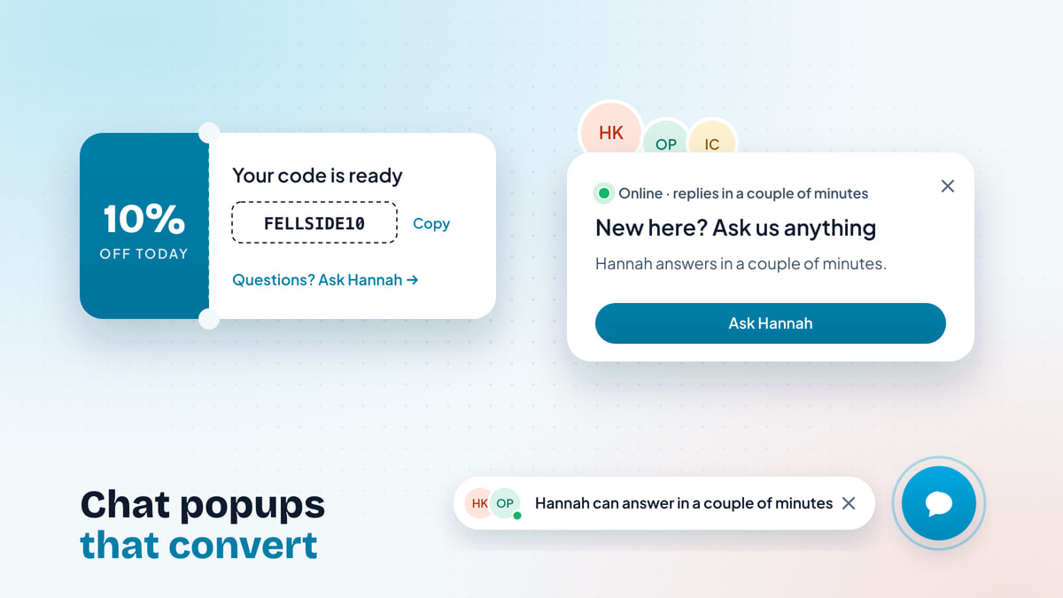
| Ticket | A tear-off stub with the code, copied in one tap | Campaign offers |
| Spotlight | A big picture card with one clear action | Talk to an expert, launches |
| Morph | The chat button itself stretches into a pill | The quietest nudge, and phones |
| Rescue card | A small card beside the error, pointing at it | A discount code or checkout step that fails |
| Order tracker | The order on a progress bar: ordered, packed, shipped | Order updates for signed-in shoppers |
| Time slots | The next three free times as tiles, in the visitor’s time zone | Booking a call |
Several carry something a generic card can’t. Ticket hands over a code the visitor copies in one tap, so the offer is never more than a click from the basket:
And Postcard puts your team on the map: its city and the local time, on paper with an airmail edge. It’s a small detail that tells visitors there are real people somewhere real:
Time slots skip the back-and-forth of booking entirely. The next three free times sit on the popup, and a tap opens the chat with the booking ready, that time first:
Your brand, not a template
Whatever the design, a popup should look like part of your site: your brand colour, your corners, light or dark to match your theme, and right-to-left for languages that need it. A popup in someone else’s styling reads as an ad, and visitors treat it like one.
Timing and frequency: one good popup beats five
The fastest way to ruin good popups is to show too many of them. Visitors judge the whole experience, not each message on its own merits. Three good popups in a single visit still feel like being followed round the shop.
Sensible defaults for most websites:
- At most one popup per visit. Two at most if your visits are long and your popups are about different things, such as a welcome and a campaign code. Help for a visitor who’s stuck is the exception: it comes on top.
- Never while the chat is open. If they’re already talking to you, a popup is noise.
- Not the instant the page loads. Let the visitor read something first. A few seconds on the page is enough to show they’re reading.
- Respect a close. If a visitor dismisses a popup, don’t bring the same one back on the next page, or for a good while after.
Popups on phones
Phones need popups more than desktops do, because finding the chat button on a small screen is harder. They also punish bad popups more, because there’s so little room.
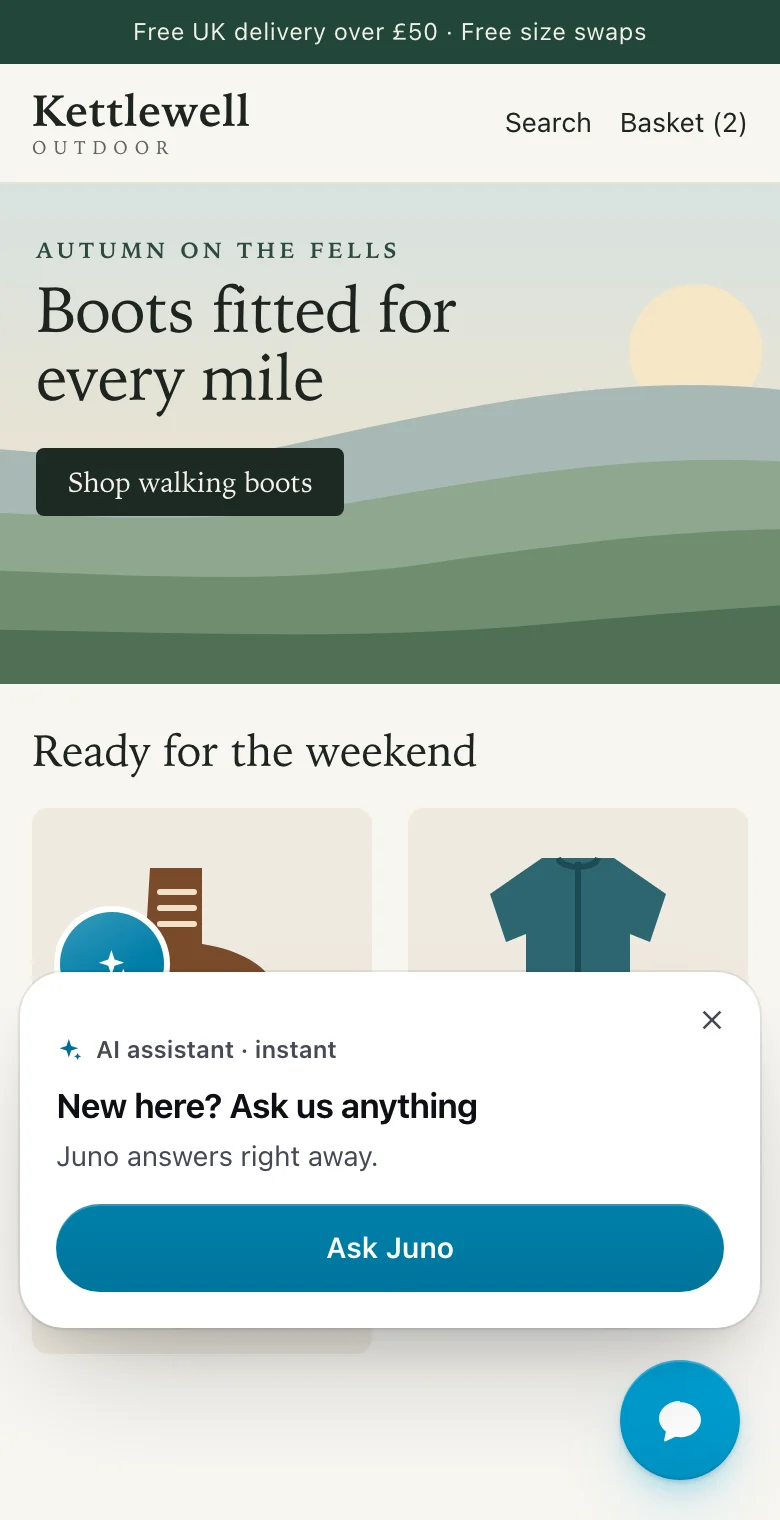
On a phone, a good popup:
- sits above the chat button, across the bottom of the screen, even when it’s help for a field higher up the page, never as a full-screen overlay that hides the page. Search engines treat intrusive mobile overlays as a poor experience, and so do visitors.
- uses a compact design. Big image cards shrink, and the smallest designs, such as the chat button stretching into a short pill, shine.
- gets out of the way. The ambient designs settle back on their own after a few seconds, and cards close with one tap.
Keep your page fast
A popup that slows your page down costs you more than it earns. Two things matter: how much code it adds, and whether it moves anything.
- Load the popup code only where a popup could show. Most page views will never show one, so they shouldn’t pay for one.
- Never shift the layout. A popup should float over the page, not push content down as it appears. Layout shift is one of the measures search engines use for page experience, and nothing frustrates a visitor faster than a button that jumps away from their thumb.
- Respect reduced motion. Visitors who’ve asked their device for less motion should see popups appear without animation.
Measure chats per view, popup by popup
You can’t judge popups by gut feel, because you never see the visitors who closed one and left. You need two numbers per popup:
- Views: how many times visitors saw it.
- Chats: how many conversations it started.
Divide chats by views and you have a fair way to compare popups that show on different pages and to different numbers of people.
An illustrative 30-day table. Campaign offer: 1,240 views, 136 chats, 11%. Pricing page: 860 views, 73 chats, 8.5%. Talk to an expert: 1,480 views, 52 chats, 3.5%. Who's answering: 18,400 views, 386 chats, 2.1%.
Reading the numbers well takes a little care:
- Compare like with like. A popup on every page will always have a lower rate than one on the basket page. Compare a popup with its own last month, or with another design on the same page.
- Read the chats, not just the count. Ten chats about which plan to buy beat fifty “just looking” hellos. Skim the conversations a popup started before you decide it works.
- Change one thing at a time. If a popup underperforms, try a more specific message first, then a different design. Switching it off is the last step, not the first.
- Give it a few weeks. A popup on a page with a few hundred views a month needs time before its rate means anything.
A starter setup for a small team
If you’re starting from nothing, here’s an order that gets value quickly without overwhelming visitors.
Your first week of chat popups
0 of 6 done
Then add the moment-specific popups one at a time: order updates once your store is connected, an expert invitation on your most considered product, free call times from your calendar, a code for your next campaign. Each one should earn its place before the next goes live.
Where popups fit with the rest of proactive chat
Popups are one part of starting conversations, alongside the others:
- Live visitors. Watching who’s on your site and writing to the right person yourself. Ideal for high-value moments a rule can’t predict. See website visitor tracking.
- Chat triggers. Short messages beside the chat button when a visitor scrolls, lingers, idles or heads for the tab bar.
- AI greetings. A short hello that Pengo Intelligence writes from what the visitor is looking at.
- An AI agent that answers. When the popup gets the click, someone has to reply. An AI agent for customer support answers instantly at any hour from your own help content, and hands over to your team when it should.
Popups are the dependable everyday layer underneath. They follow your rules exactly, they show who’s really there, and they appear at the moments that matter, so the rest of your proactive chat can focus on the conversations a rule could never predict.